Boston Red Sox jersey history through the years


The Boston Red Sox have some of the most timeless and classic jerseys in all of baseball. Here’s a look at how they changed over the years.
Ever since I was a kid, I’ve had more than a slight obsession with sports uniforms and logos. This fascination continues to the present day and isn’t just limited to baseball. However, since baseball has always been my favorite sport, I’ve always focused on the visual aesthetics of its logos and uniforms more than basketball, football, and hockey.
Within Major League Baseball, there are some teams whose uniforms are pretty much perfect. The Red Sox, Yankees, Tigers, Cardinals, Dodgers, and Cubs wear timeless, classic uniforms that have remained unchanged for most of the last century. However, some of those teams have tweaked and modified what they’ve worn for short periods of time throughout the years and the Red Sox are no exception.
I thought it would be fun to take a look back at the uniform history of the Red Sox. Before we begin, I’d like to come right out and get it out of the way by admitting that I’m a traditionalist and a purist when it comes to baseball uniforms. I believe that teams should only have two uniforms: home whites with the team name on the front and road greys with the city name on the front.
(Here’s a bit of trivia for why road uniforms are grey: in the early 20th century it was much more difficult for teams to find laundry facilities while on road trips. Grey uniforms didn’t show stains from dirt and sweat as much as white uniforms and so they could be worn more before needing to be laundered.)
I like short pants (just below the knee) and high, solid colored socks. I like stirrups but I was never as much a fan of them, whether seeing them on major league players or wearing them myself as a kid. Obviously these days long pants are more common and those are tolerable to me as long as they fit well.; I’m not a fan of the baggy “pajama pants” look that some guys preferred (looking at you, Manny Ramirez).
I also really dislike all of the alternate jerseys most teams wear, and that includes the Red Sox. We’ll get into why later on, but to me it looks like they’re wearing batting practice jerseys during games and it’s gotten out of control in recent years. It used to be only for Friday games, but now they wear them multiple times a week because they it to “starting pitcher’s choice” as to what jerseys are worn each game.
Finally, I’m only going to include the everyday uniforms the Red Sox have worn; no special occasion or holiday uniforms like Mother’s Day, Father’s Day, Player’s Weekend, and the like will be discussed. These are nothing more than merchandise grabs by the league and uniform makers and I don’t consider them part of the official uniform sets. (I told you I was a traditionalist.)
Without further ado, let’s get started.
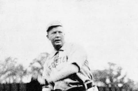
Boston Red Sox jersey 1901-1907
The Red Sox were one of the founding members of the American League and started playing in 1901. However, they weren’t initially called the Red Sox; they started out as the Boston Americans (to differentiate themselves as the AL team in Boston, which they shared with the National League’s Braves). During those years they had two uniforms. The home ones were white, the roads were grey, and both had BOSTON across the chest in blue letters.
Both uniforms were worn with high blue socks while the caps were white with horizontal blue stripes. The only change during these years was in 1902 when BOSTON was replaced with the letters BA (one letter on either side of the chest) rendered in Old English lettering (think of the Detroit Tigers D for an idea of the font). During this period, all of the jerseys were pullovers with collars and lace-up necks.
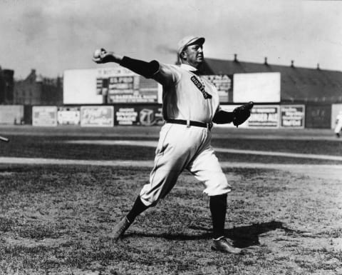
Boston Red Sox jersey 1908-1932
In 1908, the team decided to change their name to Red Sox; because of this, a change in uniforms and colors was obviously in order. The lettering and socks were changed from blue to red and for this year only, a new logo was unveiled: a large red stocking with the word BOSTON in white letters written within it.
The sock logo went away after 1908 and the uniforms had BOSTON in red letters across the chest, both home and away. Jerseys were also changed from collared pullovers with lace-up necks to button front.
In 1912, the wordmark on the chest was changed to RED SOX, but only on the road uniforms. The white home uniforms, now blank, adopted red pinstripes and white caps with red pinstripes. Apart from a few minor tweaks, these uniforms remained unchanged until the end of the 1932 season.
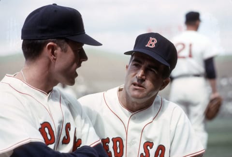
Boston Red Sox jersey 1933-1971
In 1933, the Red Sox decided to change their color scheme and they reintroduced navy into their color palette. Their caps were now navy with a block letter B in red. The home uniforms looked basically the same as they do now, white with RED SOX in red letters in the now familiar font across the chest. The road uniforms were light grey with the same lettering. In 1934, the road uniforms were changed to say BOSTON across the chest in red letters.
There were some tweaks to the color and font of the lettering on the road uniforms until 1938 when they settled on darker grey uniforms with BOSTON in navy block letters across the chest. The uniforms stayed pretty much unchanged until 1971 with a few minor exceptions. The font of the red B on the cap was changed to something approaching the same old English font we all know and love now. In 1946 the B was outlined in white which helped it pop out against the navy of the cap.
There were two other minor changes during this period. Starting in 1934 the solid red socks were swapped out for low, thick red stirrups with horizontal blue and white stripes across the top. The other change was that for the 1969-1971 seasons, the road uniforms had BOSTON in navy block letters that were outlined in red across the chest. During this time, both home and away jerseys had numbers on the back but no last names.
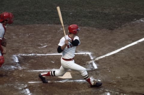
Boston Red Sox jersey 1972-1978
The 1970s brought a seismic change in the aesthetics of baseball uniforms and the Red Sox were no exception. During this decade, the traditional wool button front jerseys were swapped out for polyester V-neck pullovers and the traditional wool pants with belts were replaced by elastic-waisted belt-less polyester pants. Home uniforms were still white with RED SOX across the front in red letters and road uniforms were grey with BOSTON, also in red letters, across the chest.
The other big change during this period was in 1975 when the caps were changed to red crowns with a navy B and navy brims. While this era of Red Sox uniforms is often cited as a favorite by many (mostly those who grew up during this period and have fond memories of the really good 1970s teams), this is my least favorite period of uniforms the Sox wore.
The Red Sox ditched the V-neck jerseys and elastic waisted pants after 1978, but the majority of teams in the majors held on to them into the early 1990s. I even wore uniforms like this in the mid-to-late 1980s and early 1990s when I played Little League and junior high baseball. I didn’t get to wear real baseball pants and button front jerseys until I played in college.
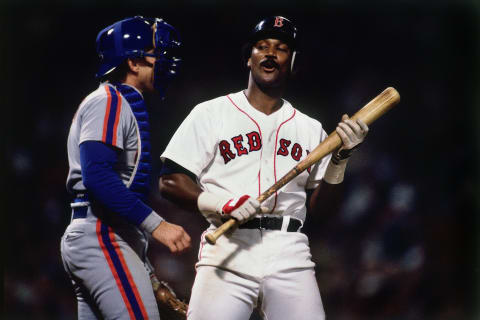
Boston Red Sox jerey 1979-1989
A welcome return to button front jerseys and real baseball pants with belts, as well as navy caps with a red B outlined in white, marked this period. Both the home and away uniforms reverted to the classic designs of the 1946-1968 period. The home whites had RED SOX in their classic stylized font across the chest and road greys had BOSTON in navy block letters across the chest. Both uniforms had numbers on the back but no last names.
Also, the low-rise stirrups gave way to white socks with long, thin red stirrups. The other big change was the uniforms being made of synthetic fabrics as opposed to the baggy wool of the pre-1972 uniforms. This led to uniforms that were more fitted and looked a lot cleaner.
The home uniforms look the same today and are my favorite version of the home whites. As for the road uniforms, these are hands down my favorite road uniforms the Red Sox have ever worn.
As much as I like the current road uniforms, I would absolutely love it if they went back to the road uniforms of the 1980s as their permanent road grey set.
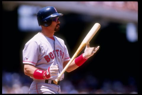
Boston Red Sox jersey 1990-2008
There was no change to the home uniforms … the big change starting in 1990 was on the road uniforms. The BOSTON across the front was changed to red and used the same font as the RED SOX did on the home uniforms. The numbers on the back were changed to red, but the biggest change was the addition of names on the back of the jerseys.
These road greys look really nice and are among the best looking road uniforms in all of Major League Baseball, but I like them slightly less than the previous set. Call me old-fashioned. The only other notable change during this period wasn’t specific to the Red Sox but across MLB in general. The pants got longer and baggier, showing less and less of the stirrups until they eventually covered them all together.
Again, my favorite look is the short pants with high solid colored socks (or stirrups if we can’t have the socks). I’ve grown to tolerate the long pants as long as they fit well, but when they’re baggy and look like pajama bottoms, I can’t stand them.

Boston Red Sox jersey 2009-2013
The Red Sox decided to throw it back a bit when they changed their road uniforms for this short period. The word BOSTON on the front and the names and numbers on the back were now rendered in navy letters, and BOSTON on the front used the same stylized font as before. It seemed as though the team was trying to have the best of both worlds, melding the color scheme of the pre-1990 road uniforms with the font and names of the road uniforms they were replacing.
One other small addition that would remain beyond these uniforms was the addition of a “hanging Sox” patch on the left sleeve (but only on the road greys). To be honest, I was never a huge fan of this road look. While I welcomed the return to the blue letters and numbers, BOSTON looked kind of weird in the classic English font in navy and the last names also just looked…strange. I can’t explain it other than they never looked quite right to me.
These road uniforms also coincided with a down period of Red Sox baseball during this era; apart from the magical 2013 season, these were pretty tumultuous seasons that I think most of us would prefer to forget (especially 2012).

Boston Red Sox jersey 2014-present
That brings us to the current Red Sox jersey. After 2013, the Red Sox went back to their 1990-2008 road uniforms, only now with the addition of the “hanging Sox” patch on the left sleeve. The red letters and numbers on the road uniforms were back and the home uniform remained unchanged. Both of the current uniforms the Red Sox wear are classic, timeless, and among the best in the league. These are my favorite home uniforms while these road uniforms are a close second after the 1979-1989 road greys.
As for the alternate “batting practice” jerseys (or “softball tops” as many call them), I’ll touch on them briefly and start by saying that I don’t like them at all. Looking first at the home red alternates: it’s just too much red. I know that sounds silly when discussing a team with the word RED in their name, but part of the beauty of their uniforms has always been that the red is more of an accent color; the gorgeous crimson red pops against navy blue, white, and grey.
The B on the hat, the lettering for RED SOX or BOSTON across the front, the numbers on the back, and of course the socks are the only red things on the uniforms. Those splashes of red look great against the crisp white or grey uniforms and the navy blue of the caps. When the entire jersey is red it’s just garish in my opinion. The RED SOX lettering in blue across the chest also gets swallowed up by all of that red.
The blue road alternates are much better, but still not great. While the deep navy is easier on the eyes and the red BOSTON pops against the blue much better than the blue lettering on the reds, it’s still too much blue. If I had to choose one alternate to keep, it would be this one without a doubt, but I still don’t like solid colored jerseys and it’s always looked a bit funny against the grey pants with red stripe and the red socks.
They don’t clash, but they don’t really go well together either. What makes me viscerally dislike them even more is that the Red Sox wore these tops for all three road games in Los Angeles during the 2018 World Series. Paired against the Dodgers beautiful and timeless home uniforms, it was a jarring contrast and a real missed opportunity to see two teams with two of the best uniforms in all of baseball of all time go head to head.
Red Sox All-Rookie Team. dark. Next
So there you have it, a complete history of Boston Red Sox uniforms. To reiterate, the current home uniforms, which have remained essentially unchanged over the last ninety years or so apart from the years 1972-1979, get my vote for best Red Sox home uniforms. As for the road greys which have been changed much more frequently over the years, the 1979-1989 road uniforms get my vote for the best in Red Sox history.